


Key Takeaways
- Use the color wheel. It helps you choose matching colors. They make your brand look better and more consistent.
- Use layers, shades, tints, and tones to add complexity and visual interest to acrylic signs.
- Advanced pigment technology offers a wide range of durable and vibrant colors for acrylic signs.
- Matte finishes reduce glare and improve readability, providing a modern and sophisticated look.
- Metallic accents can elevate the elegance of signs. This ensures they catch the eye without overwhelming the design.
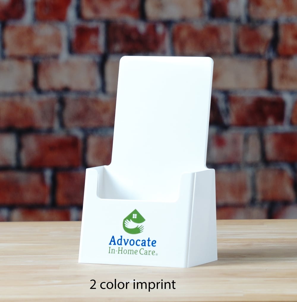
Choosing the right colors for acrylic signs is key. They make the signs both look good and communicate well. The colors you pick can greatly affect how a viewer sees a sign. From acrylic sign holders to custom printed acrylic signs. Understanding color choice is key for making impactful visual tools.
Some tips in selecting the right color include:
- Consistency
- Visibility and Readability
- Psychological Impact
- Customization
This guide will further cover how to pick the best colors for your custom printed acrylic signs. The goal is to make them as effective as possible and to ensure they match your brand.
Choosing The Right Base Color
Color theory is foundational for choosing colors that work well together. Whether you are designing brochure holders or large-format acrylic sign holders, selecting the right base color is essential to enhance aesthetic appeal and maintain brand consistency.
Using The Color Wheel
The color wheel is a vital tool in identifying harmonious color schemes. It helps in selecting colors that complement each other, offering a visual representation of how colors relate. Using color harmonies like complementary (colors opposite each other on the wheel), analogous (colors next to each other), or triadic (three colors evenly spaced around the wheel) can enhance the visual impact of your sign.
Adding Depth With Layers Of Paint
Adding depth to your acrylic signs can be achieved through effective layering of paint. Start with a solid base coat and add multiple layers, using both lighter and darker hues to create dimension. When adding layers of paint to acrylic signs, consider how each layer will affect the overall look and feel of the sign. This layering can evoke a sense of quality and craftsmanship that flat, single-color signs lack.
Utilizing Shades, Tints, And Tones
Shades (color + black), tints (color + white), and tones (color + gray) are essential for adding complexity and visual interest to your signs. This approach allows you to fine-tune the color's impact, adjusting the brightness or darkness to fit the sign’s environment and purpose. Shades can create a more profound, somber look, tints can soften and brighten, and tones can help achieve a more subtle, sophisticated appearance
Exploring A Wide Range Of Colors
Acrylic paints provide a vast spectrum of colors, which has expanded significantly due to advancements in pigment technology. The colors available are more vibrant and longer-lasting than ever, offering excellent color retention and dimensional stability. This makes acrylic an ideal medium for creating signs and acrylic sign holders that need to stand out and endure the elements.
Tips For Selecting Colors Aligned With Branding Or Aesthetic Goals
- Consistency: Choose colors that align with your brand’s existing palette to maintain consistency across all visual elements. This helps reinforce brand recognition and enhances professional appearance.
- Visibility and Readability: Select colors that offer high contrast between the background and the text or design elements to ensure that the signs are easy to read from a distance. This is particularly important for informational or directional signage.
- Psychological Impact: Different colors can evoke different emotions. For example, blue can convey trust and reliability, making it a popular choice for corporate environments, while bright colors like red or yellow can attract more attention and are often used for sales or promotions.
- Customization: With digital printing techniques, any color or pattern can be printed onto acrylic signs, allowing for precise PMS color matching to ensure that the colors of your sign perfectly match your brand specifications.
Utilizing Matte Finishes For A Modern Look
Matte finishes on acrylic signs and brochure holders are increasingly popular due to their sophisticated and contemporary aesthetic. A matte finish reduces glare, which makes signs easier to read under various lighting conditions, such as strong sunlight or bright indoor lights. This finish also tends to hide fingerprints and smudges, maintaining a clean and professional look over time.
Advantages Of Matte Finishes
- Sophistication and Elegance: Matte finishes convey an understated elegance, suitable for luxury brands or premium service providers.
- Reduced Glare: Ideal for locations with intense lighting, matte finishes improve readability and viewer comfort.
- Durability: Matte surfaces are less likely to show minor scratches and imperfections, which helps in maintaining the appearance of the sign over time.
Potential Applications
- Indoor Use: Matte finishes are perfect for indoor environments where harsh lighting can cause reflections on glossy surfaces.
- Outdoor Use: They are also suitable for outdoor use where signs might be subjected to varying lighting conditions throughout the day.
- Versatile Design: Whether used in minimalistic designs or more elaborate displays, matte finishes can enhance the visual impact of the sign without overwhelming the design elements
Incorporating Metallics For A Touch Of Elegance
Metallic finishes for printed acrylic signs can elevate the look of your signage, providing a premium feel without overwhelming the primary design elements. These finishes add a touch of luxury and can reflect light, creating a dynamic visual effect that attracts attention.
Tips For Using Metallics
- Balance and Subtlety: Use metallics sparingly to enhance key features of your sign without dominating the overall design. This can be achieved by using metallic finishes as accents or borders rather than the main color.
- Complementing Colors: Pair metallic hues with neutral backgrounds or soft color palettes to keep the design elegant and not overly flashy. For instance, gold metallic on a deep blue or black background creates a sophisticated contrast.
- Consistency with Brand Image: Ensure that the metallic tones align with your brand’s image and color scheme. Metallics should enhance the brand’s identity, not distract from it.
- Testing and Samples: Before finalizing the design, consider producing samples to see how different metallic finishes look in various lighting conditions, as their appearance can change dramatically from indoor to outdoor settings
Considering Contrast And Readability
Effective contrast is not just vital for acrylic sign holders; it's also crucial when designing custom acrylic signs to ensure that they are readable from various distances. Proper contrast ensures that your message is legible and effective, capturing the attention of your audience.
Strategies For Enhancing Contrast And Readability
- High Contrast Colors: Use color pairs that stand out against each other. Classic combinations like black on white or yellow on blue can improve legibility. For signs intended to catch the eye from afar, such as roadside or directional signage, high contrast is essential.
- Background Consideration: Choose a background color that complements but contrasts with the text and graphics. This helps the content stand out more clearly against the backdrop.
- Lighting and Environment: Consider the sign’s environmental placement and lighting conditions. For example, a sign placed in a brightly lit area may require a matte finish to reduce glare and improve readability.
- Text Size and Font Style: Larger text and clearer, bolder fonts enhance readability. Avoid overly decorative fonts which can become illegible from a distance.
Frequently Asked Questions
What are the benefits of using acrylic signs?
Acrylic signs are durable, weather-resistant, and come in a wide variety of colors and finishes. They are also lightweight and easy to install.
How can I choose the right color for my acrylic sign?
Consider using the color wheel to find complementary colors that will look good together. You can also use shades, tints, and tones of a single color to add depth and interest to your sign.
What is the difference between a matte and glossy finish?
A matte finish will reduce glare and make your sign easier to read in bright light. A glossy finish will be more reflective and eye-catching.
Can I use metallic finishes on my acrylic sign?
Yes, metallic finishes can add a touch of luxury and elegance to your sign. However, it's important to use them sparingly and to choose colors that complement your brand image.
How important is contrast for my acrylic sign?
Contrast is very important for making sure your sign is readable. Use colors that stand out against each other, especially if your sign needs to be seen from a distance.
What size and font should I use for the text on my sign?
Use larger text and clear, bold fonts to improve readability. Avoid using overly decorative fonts that can be difficult to read.
Choose The Best Colors For Your Custom Acrylic Signs With Displays & Holders
Choosing the right colors and finishes for acrylic signs is not just about looks. It's also about function and brand alignment. You may be creating a simple brochure holder or complex custom printed acrylic signs. The rules of color theory and finish selection can change how your signs are seen. It also impacts how your audience engages with by you. By applying color theory and understanding finishes, you can greatly improve your signs. The goal is to make your signs beautiful. They should also be useful and show your brand's values and message.
Transform your brand's visibility with custom printed acrylic signs! Explore Displays & Holders custom sign solutions today and create signage that makes a lasting impression!


