


Key Takeaways
- Color Influences Brand Perception
Colors play a pivotal role in shaping how consumers perceive a brand's personality and values. For instance, blue often conveys trust and competence, while red can evoke excitement and urgency. Selecting appropriate colors aligns brand identity with desired consumer emotions. - Color Impacts Purchasing Decisions
Consumers often make quick judgments about products based on color, influencing their purchasing choices. Attractive color schemes can draw attention and enhance product appeal, while unattractive colors may deter potential buyers. - Cultural Differences Affect Color Interpretation
Color meanings can vary significantly across cultures, affecting consumer responses. For example, red symbolizes luck in many Asian cultures but can represent danger in Western contexts. Understanding these differences is crucial for global marketing strategies. - Color Combinations Influence Aesthetic Appeal
The use of harmonious or contrasting color combinations can impact consumer preferences and perceptions of products. Harmonious color schemes are generally preferred, but strategic contrasts can highlight specific features or create visual interest. - Color Names Affect Consumer Attraction
The specific names given to colors can influence consumer preferences and purchasing decisions. Creative or unique color names often make products more appealing, as they evoke imagination and positive associations.
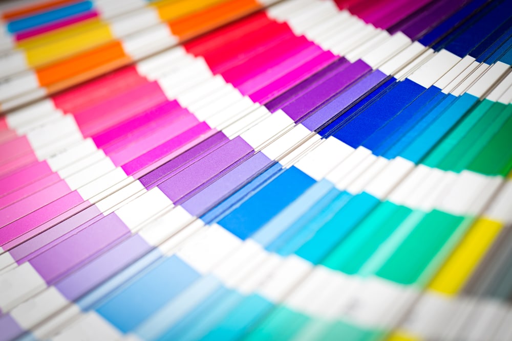
While most people think of color as something that’s purely visual, designers have a deep understanding that color, when used in design and in nature, is both visual and psychological in its effects.
Color is one of the most important aspects of visual design. It’s also one of the least understood and studied, with many designers preferring to focus on structure, lines and shapes, as well as other design elements.
Design can have a huge effect on how people perceive your products, your services, your brand and your business as a whole. In this blog post, we’ll share four ways how the colors used in your branding and marketing can affect people’s brand perception.
Create urgency
If you’re involved in direct marketing, whether on television or via direct mail, you may want to create a sense of urgency in your audience. Urgency inspires people to act quickly in order to claim your product and encourages immediate action.
We’ve all seen bright red “Limited Quantity” notices or yellow “This offer expires in 90 minutes” messages. This is for a reason – bright and hot colors like red, yellow, orange and more command attention and create a feeling of urgency.
This is the reason that many call to action buttons in digital marketing and graphic design are red or orange. If you want to create a sense of urgency, the bright, warm colors at the best choices.
Develop prestige
Have you ever noticed that luxurious brands – from Rolls Royce and Mercedes Benz to Rolex and Louis Vuitton – use the same colors very frequently in their marketing and branding campaigns?
Colors like brown, purple and royal blue are used to develop a prestigious image – one that elevates your brand above its peers. Luxury brands in a range of different markets all use these colors to create prestige and a sense of elevated status.
If your business sells products or services that are more expensive than those your peers offer, using color to increase your prestige and set your brand further ahead than its major competitors is a great way to increase your audience’s desire.
Inspire relaxation
Advertising doesn’t just inform you of great deals or illustrate a product or service’s value – it can also inspire certain feelings. One of the most valuable feelings to create through advertising is a sense of relaxation, calmness and tranquility.
Light colors, particularly light blue, green or pink, are calming. They create a sense of relaxation and calmness that’s made them a favorite of spas, salons and various other relaxation-focused businesses.
From shampoo to body massages, products and services that are all about calmness and relaxation are best marketed using calm colors. Baby blue, light pink, green and other colors all inspire feelings of relaxation and make your offer more appealing.
Emphasize trust
From banks to insurance companies, many businesses depend on trust to acquire and retain their customers. There’s a reason so many financial companies use blue heavily in their advertising: more than any other color, it effectively builds trust.
Trust is an important element of marketing, and colors like blue (and dark green, to a lesser extent) are ideal for building trust. Ask yourself: Would you trust a bank if it used pink, orange or bright green in its marketing instead of old fashioned blue?
If your product, service or business is heavily dependent on trust, consider using a dark, trust-building color like blue or green. Doing so can set your business apart as a trustworthy brand and increase both customer interest and retention rates.
FAQs
- How does color influence consumer behavior?
Color affects emotions and perceptions, leading consumers to make rapid judgments about products. The right color choices can enhance brand recognition, convey desired messages, and influence purchasing decisions. - Why is understanding cultural color meanings important in marketing?
Different cultures associate colors with various meanings; misaligned color choices can lead to misunderstandings or negative perceptions. Tailoring color usage to cultural contexts ensures effective communication and brand acceptance. - Can the color of a product's packaging affect sales?
Yes, packaging color significantly impacts consumer attraction and product perception. Appropriate colors can convey quality, evoke emotions, and differentiate products on crowded shelves, thereby influencing sales. - How do color combinations affect consumer preferences?
Harmonious color combinations are generally more pleasing and can enhance product appeal. However, strategic use of contrasting colors can draw attention to specific features or create a bold brand statement. - Do unique color names really impact consumer choices?
Yes, creative color names can make products more enticing by evoking imagination and positive associations. Consumers may perceive uniquely named colors as more appealing, influencing their purchasing decisions.


