


Key Takeaways
- Strategic Exterior Signage Placement
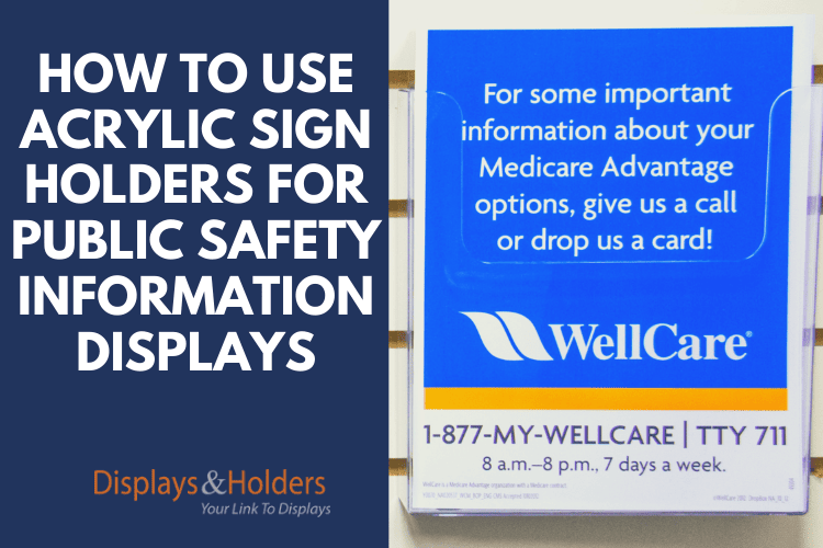
Positioning acrylic sign holders on the exterior of your facility ensures that critical public safety information is visible to individuals before they enter. Placing these signs near main entrances or high-traffic areas effectively captures attention and communicates essential messages promptly. - Employ Clear Visual Design Elements
Utilizing bold colors, legible fonts, and straightforward language in your signage enhances readability and comprehension. Effective visual design ensures that safety messages are quickly understood, reducing the likelihood of confusion among viewers. - Select Appropriate Sign Holder Styles
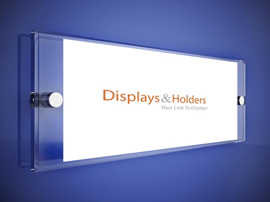
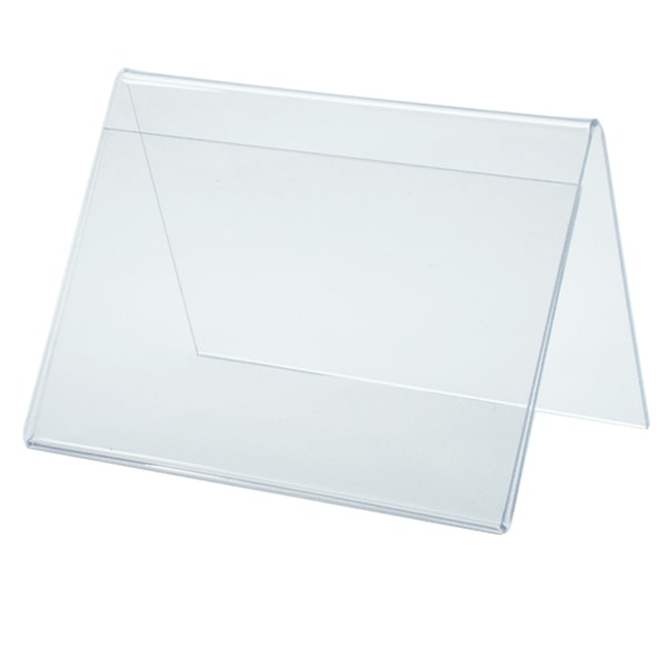
Choosing the right type of acrylic sign holder—such as wall-mounted or tabletop versions—based on the intended location and audience interaction optimizes visibility and accessibility. This selection ensures that safety information is presented in the most effective manner for the given environment. - Maintain Signage Cleanliness and Integrity
Regularly cleaning acrylic sign holders prevents the accumulation of dust and smudges, preserving clarity and professionalism. Ensuring that the displayed information remains legible and the holders are in good condition maintains the effectiveness of your safety communications. - Adapt Signage to Environmental Conditions
Utilizing weather-resistant acrylic sign holders for outdoor safety information displays ensures durability against environmental factors. This approach maintains the integrity and visibility of safety messages, providing reliable information to the public regardless of weather conditions.
Whether it's to spread awareness about a national pandemic or a simple reminder to wash your hands, sharing safety information to the public is crucial. Your customers, clients, and visitors need quick and easy access to instructions. Luckily, there are a variety of inexpensive options that can help you broadcast your message. From tabletop sign holders to wall-mounted brochure holders, there are endless ways to spread the word.
Unfortunately, a powerful message isn't as simple as merely writing out a sign and sticking it into an acrylic sign holder. When it involves public safety, you’ll want your message to stand out in the most effective ways possible.
Here are some of the top tips for using sign holders to display information regarding public safety:
Utilize Signage on the Exterior
In many cases, you need people to have information before they even step foot in your location. The information you're providing should stand out and grab the attention of anyone passing by. While you want your signs to be bold, you also don't want to break general design fundamentals.
Exterior signs and other pieces of safety information can be easily placed in wall-mounted or acrylic sign or multi-pocket brochure holders. These should be placed in areas of high traffic, such as near significant entrances. This is the perfect way to let customers know if your business is closed, has reduced hours, or has moved to an online or appointment only system.
Yes, typing your message on a single sheet of white paper in the largest font that will fit is one way to make sure your message is posted, but 9 times out of ten will surely be overlooked instead of read. When it comes to safety, you don't want people to ignore your message.

The Fundamentals of Visual Elements
You definitely don't have to be a professional designer to create a sign that stands out. Simple messages can certainly utilize simple designs, but spending a few extra minutes can help increase awareness of what you're attempting to share.
Here are some elements you should consider when designing your sign:
Contrast
Contrast is what sets the main aspects of your sign apart from the related information. Contrast is also a great way to attract attention to your sign. Two of the most common and easiest ways to emphasize contrast is with fonts and colors.
Fonts should be arranged in your sign so that there is a difference between the main message, headline, secondary message, etc. By simply contrasting the font's size, style, and weight, you can make certain elements stick out.
When it comes to sharing safety information, larger bold fonts should not only catch the viewer's attention, but relay urgency. The main message font can be heavier than secondary messages, instructions, and so on. If you're designing a brochure, make sure each section has a title that stands out from the rest of the text.
It's also important that the fonts you select are easy to read. It's best to stay away from anything that appears too elegant. People aren't going to take the time to decipher what the sign says if it's hard to read.
General design rules also only allow for two fonts on any piece of content. Contrasting colors are an easy way to gain attention. In the most extreme case, black on white is about the most prominent contrast there is, but this combination is also somewhat dull, overused, and essentially overlooked.
Imagine reading an announcement written in black, except for a single word in red. The created contrast is going to put emphasis on the word in red. This is an easy way to draw attention to your message while focusing on specific words.
Balance
Eye-catching designs manage the delicate balance between positive and negative space. Positive space is the area that uses letters and images. Negative space is what is around these images and texts. Managing the negative space is just as important as focusing on the content of your message.
A sign that is filled with information is not only challenging to read, but is easily ignored. A balanced image has empty space around the content, which helps the message stand out.
Interior Signage
Whenever you need to display safety information inside your facility, tabletop sign holders or wall-mounted options work wonders. Just like with external signs, you’ll want to follow general design fundamentals and post information in appropriate areas.
If you are displaying general safety information or anything that is not extremely pertinent, brochure holders are often placed near the exit or by a bathroom. These are the standard places people look at for bulletin boards and other information. Time-sensitive displays with crucial information should be placed in critical areas, like entrances, etc.
One advantage of interior signage is that you can relay specific safety information in suitable locations as needed. For example, a tabletop sign holder near a checkout lane can indicate the required distance between customers, and an acrylic wall-mounted sign holder in the bathroom can remind employees to wash their hands before returning to work.

Good Signs Guide Your Audience
A good sign doesn't just provide information; it helps direct what people should do. It's easy to simply place a sign on the door saying that you're closed due to a local outbreak, gas leak, or something else that puts customers in danger.
The better option would be to indicate that you're closed and then point customers to how they can still use your business, perhaps online or over the phone.
Guiding your audience also means not being too aggressive. A large, bold-printed sign that says "WASH YOUR HANDS" might come off as yelling at people. Something that suggests that "washing your hands keeps you, your colleagues, and customers safe" helps guide people to the right actions without yelling.
Test Your Signage
 After you've created a well-balanced and contrasting sign, placed it in the correct acrylic sign holder, and displayed it in a key area - take some time to evaluate it. Ask colleagues or friends to walk by and share their reactions.
Do not be afraid to make changes if you're not seeing the results you’re trying to achieve. One of the best benefits of acrylic sign holders is the fact that you can move them around as you see fit until you get exactly the results you’re looking for.
Health concerns are serious issues; the information you communicate could keep someone from getting sick or even save lives. Take the time to make signs that will not only catch attention but will plainly communicate your message. Make sure to place your sign or brochure in the appropriate acrylic sign holder, and you’ll truly make a difference!
FAQs
- How can I ensure my safety messages are noticed before entry?
By placing acrylic sign holders with essential safety information at exterior locations, such as near main entrances, you ensure that individuals are informed prior to entering your facility. This proactive approach enhances awareness and compliance with safety protocols. - What design elements enhance the effectiveness of safety signage?
Incorporating bold colors, clear fonts, and concise language in your signage design captures attention and facilitates quick understanding of safety messages. These elements are crucial for effective communication in public safety contexts. - Which type of acrylic sign holder is best for high-traffic areas?
Wall-mounted acrylic sign holders are ideal for high-traffic areas as they securely display information at eye level without occupying floor space. This placement ensures that safety messages are prominently visible to passersby. - How do I maintain the clarity of my acrylic sign holders?
Regular maintenance involves cleaning the acrylic surfaces with appropriate, non-abrasive materials to prevent scratches and maintain transparency. This upkeep ensures that safety information remains clear and professional in appearance. - Are acrylic sign holders suitable for outdoor safety information?
Yes, acrylic sign holders are suitable for outdoor use, especially when made from weather-resistant materials. They effectively protect and display safety information, ensuring durability and visibility in various environmental conditions.


