


What design elements do you think have the greatest impact on your brand? While most business owners think of color as having the greatest effect on the way people perceive their business, the typefaces you use often have an even greater effect.
Choosing the right font can set your business apart from its competitors and give it an unforgettable visual identity. Choosing the wrong font, on the other hand, is one of the biggest branding mistakes your business can make.
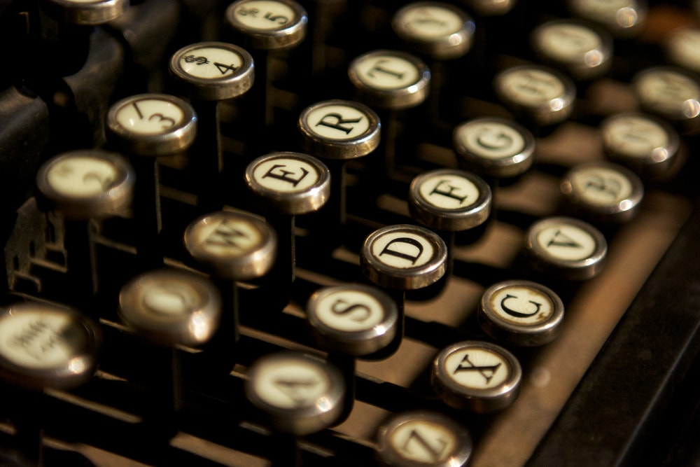
From quirky fonts used to promote serious businesses to archaic fonts used in the high-tech sector, there have been plenty of font and business mismatches over the years.
In this guide, we’ll share four tips to help you choose great fonts for your corporate identity. From business cards to brochures and more, read on to learn how you can choose the right font for all of your company’s print and digital marketing material.
Group the fonts you use by category
One of the most important aspects of choosing fonts for your business is aesthetic consistency. Fonts with similar characteristics look good beside each other, while dissimilar fonts can clash and produce an unusual, uncomfortable look.
When choosing fonts for your corporate identity, it’s important that the fonts you select match each other by category. Traditional fonts look good alongside other traditional fonts, while modern fonts look good alongside other modern fonts.
Group fonts into categories – classic, geometric sans-serif, slab serif and more – to give them a distinct identity. Your company’s branding should only ever use one or two font categories – use more and you risk creating visual disharmony.
Choose the right font for your industry
What beliefs and benefits are key to your product or service’s success? Each and every industry has a unique benefit or characteristic that sells it to prospects – a vital component of your brand’s identity that can’t be neglected.
It’s important to choose a font that matches your industry’s demands, values and beliefs. A “funny” font like Comic Sans might look great for a children’s daycare or preschool, but it’s obviously not suitable for a forensic accountancy firm.
Choose the right font not just for your business, but for your industry. Use the font categorization technique above to group fonts by type, and study your competitors to see which font categories they use most prominently in their branding.
Use simple, readable fonts for paragraph text
Although the current tastes of graphic designers tend to be simple, there’s nothing wrong with using a heavily stylized font for your heading or corporate logo. Stylish fonts look good when used properly, and can make your brand stand out.
However, using a heavily stylized font for small text can often make it difficult for people to read. Fonts with accents and lots of aesthetic personality can look overly complex and ornate when downsized into a dense block of text.
While it’s fine to use stylized fonts for your headings and logos, avoid using anything but the basics for paragraphs and small print. Simple fonts should always be the first option you choose for paragraph copy, as they’re typically the most readable.
Create aesthetic harmony by pairing different fonts
The world’s most memorable compositions – from classical music to 20th century rock – used musical contrast to great effect. Loud, heavy sections were matched by quiet, laid back periods to create a sense of contrast and harmony.
The graphic design equivalent is aesthetic harmony – pairing two different fonts to create a sense of balance. In the case of a business card or corporate logo, this could be a dark, heavily stylized font paired with a light and simple sans-serif font.
Aesthetic harmony adds balance to your company’s image, making it more visually appealing to your target audience. Instead of going all light or all bold, pair both to create interesting visual contrast that balances your company’s branding.


