


Key Takeaways:
- Consistency is Key: Top companies use consistent branding across all signage to ensure recognition and recall. Maintaining uniform fonts, colors, and logos across all platforms reinforces brand identity and makes the signage more memorable.
- Simplicity for Impact: Successful brands keep their signage simple and straightforward. Avoiding clutter and focusing on a clear, concise message ensures that the information is easily absorbed and remembered by viewers.
- Creative Use of Technology: Leading brands incorporate technology, such as digital displays or interactive elements, to captivate their audience. These tech-driven designs create dynamic, engaging experiences that leave a lasting impression.
- Strategic Placement: Placement of signage is crucial for maximum visibility. The world’s biggest companies understand the importance of situating signs in high-traffic areas to capture attention, whether inside stores or along busy streets.
- Emotional Appeal: The most effective signage connects with audiences emotionally. Top companies design signs that not only convey information but also evoke feelings, making the message more impactful and memorable to viewers.
Have you ever spotted a recognizable sign from several hundred yards away? There is a simple reason you recognize signs from big companies and forget others: many of the world’s biggest companies have mastered designing for memorability.
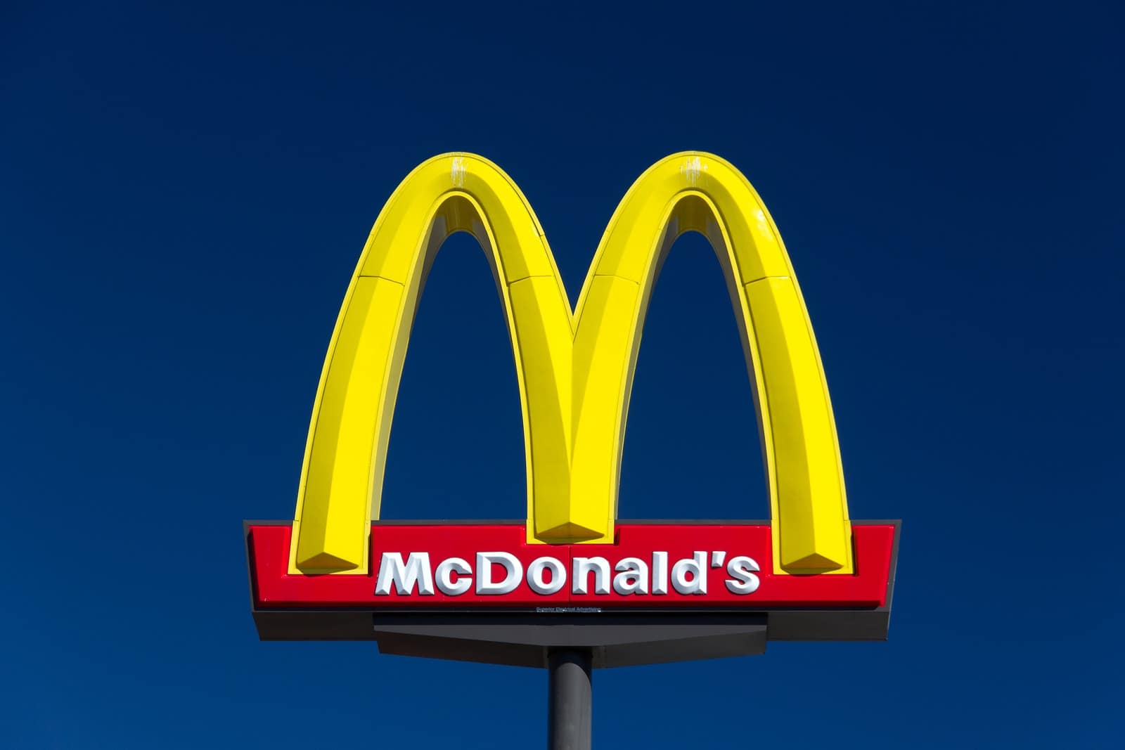
From McDonald’s to Citibank, many of the world’s largest companies design their signage and branding items not to stand out from the crowd, but to make it easier for potential customers to remember them.
They do this using a number of techniques, ranging from basic marketing ideas to certain color choices. Read on to learn how your business can use the same tactics as the world’s leading companies to produce more memorable signage.
They keep everything simple
From fast food chains to retail stores, the world’s biggest brands all obey one rule in their retail signage design: simplicity first. Almost all large businesses use extremely simple sign designs in order to make their retail signs more memorable.
Keep your signage – and the rest of your company’s branding – as simple as possible so that it’s easy to remember. People are far more likely to remember a simple logo than a complicated sign with several different messages.
They design for memorability
Because the world’s most well-known corporate logos are designed for simplicity, they tend to be easy to remember. Large companies know the immense value that return customers offer, and as such focus on being remembered.
How can your business make its signage more memorable? From bold colors to a simple logo that sticks in people’s memories, use design elements to ensure your signage is as easy as possible for people to notice and memorize.
They don’t waste any space
Have you ever seen any wasted space in a big company’s signage? While it’s vital that your signage isn’t cluttered, it’s also important that you avoid wasting space that could be used to effectively communicate your company’s message.
White space is essential for breaking up the different elements of your signage, but it shouldn’t be overused. Use as much space as possible to get the biggest possible impact from each of your retail signs.
They use highly visible colors
The reason you notice signs for shops such as Wal-Mart and McDonald’s from miles away is because they’re designed for visibility. High-contrast color combinations are often all it takes to make signage visible from an incredible distance.
How visible is your signage from a distance? Choosing a color combination that can stand out from far away makes your signage easier for people to see, and therefore significantly easier to remember.
Maximizing Brand Visibility with Strategic Sign Holder Placements
When designing signage that’s remembered, it's not just about the design of the sign itself. The placement and presentation of the signage can significantly impact its effectiveness. Some of the world’s biggest companies understand the importance of strategic sign holder placements. By using the right types of sign holders—such as tabletop, wall-mounted, and acrylic sign holders—they ensure that their messaging is seen, understood, and remembered by customers. Let’s explore how these placements can enhance your signage strategy.
Tabletop Sign Holders: Engaging Your Customers Up Close
Tabletop sign holders are a great way to capture attention in high-traffic areas, like check-out counters or reception desks. These holders allow businesses to showcase important messages, special offers, or promotions at eye level, making them easy for customers to see and engage with. Whether you’re offering a limited-time discount, featuring a product of the month, or simply highlighting your brand story, tabletop sign holders bring your messaging directly to your customers in a compact and organized format.
Major brands often use tabletop sign holders in various settings, such as retail stores, restaurants, and trade shows, to keep their messaging clear and accessible. The compact size and ease of placement make these holders versatile. For example, a small tabletop holder might feature a quick call-to-action like “Ask About Our New Product!” or “Follow Us on Social Media for Updates!” This simplicity ensures that the message stands out without overwhelming the customer.
Wall-Mounted Sign Holders: Leveraging Vertical Space for Maximum Impact
Wall-mounted sign holders allow businesses to maximize their space and make the most of their signage real estate. By placing signs at eye level on walls, businesses create a visual experience that’s not only efficient but effective. The world’s largest brands are experts in utilizing wall-mounted signage to reinforce their identity and showcase important details like promotions, brand ethos, or product benefits.
Wall-mounted sign holders are ideal for displaying large, high-impact graphics, offering directional information, or listing services. Whether you’re directing customers to the fitting room, highlighting store sections, or simply providing instructions in a corporate office, wall-mounted holders ensure that your signs are visible from across the room or store. These holders also help maintain a clutter-free environment, which contributes to a clean and professional image, a key component of many successful brands' visual strategies.
For instance, a global retail brand might opt for sleek, minimalistic wall-mounted holders that provide directional arrows or brand messages. This allows customers to easily navigate through large spaces, all while staying engaged with clear, branded communication. The vertical placement of these signs takes advantage of high-traffic areas where people might miss other forms of signage.
Acrylic Sign Holders: Combining Style with Functionality
When it comes to durability and visual appeal, acrylic sign holders are an ideal choice. These clear, sleek holders provide a modern and polished look, helping to elevate any signage, whether in a retail store, office, or exhibition. Acrylic holders offer versatility as they can be placed on tables, mounted on walls, or used as freestanding displays. They are perfect for showcasing printed materials like brochures, flyers, or product information while keeping the focus on the content rather than the holder itself.
For large corporations, acrylic sign holders are a go-to option due to their ability to offer a professional appearance while maintaining functionality. Acrylic holders can be customized to suit a variety of sizes and needs, from small countertop displays to larger wall-mounted installations. These holders not only protect your materials from damage but also ensure they remain upright and clearly visible, adding a polished look to any space.
In retail environments, acrylic holders are often used to display price lists, product features, and promotional flyers. The clear nature of acrylic allows the signage to blend seamlessly into the overall store design while still standing out enough to attract attention. For companies like Apple and Nike, acrylic holders are used in stores to display product specs or highlight limited-time offers, making them a crucial tool for driving sales and engagement.
Creating a Cohesive Signage Strategy
By thoughtfully incorporating tabletop, wall-mounted, and acrylic sign holders into your signage strategy, you can significantly increase the visibility and impact of your marketing materials. These placements ensure your signs are seen, noticed, and remembered, creating a cohesive experience for customers that reinforces your brand identity.
Strategic sign holder placement helps brands like Coca-Cola, Starbucks, and McDonald's create memorable, consistent, and professional signage that reflects their commitment to quality and customer engagement. By following their example and utilizing versatile sign holders, you too can craft signage that stands out, engages customers, and leaves a lasting impression.
They design with action in mind
How action-focused is your signage? Great signs not only communicate a message and stand out from the background – they’re also designed and written to deliver a very specific message to their target audience.
From encouraging people to visit you retail store to pointing them towards your company’s website, make sure all of your signs are designed with action in mind, since people will remember the action each sign prompts before anything else.
FAQs
1. What are some low-cost tabletop promotion ideas for small businesses?
Small businesses can use affordable branded materials like tablecloths, flyers, and acrylic display stands. Incorporating small promotional items, such as pens or magnets, can attract attention. DIY signage and creative setups maximize appeal without overspending. Focus on quality over quantity to stand out.
2. How can I create an effective tabletop display on a limited budget?
Start with reusable materials like acrylic holders or cardboard props for structure. Add bright, bold signage and consider using a tablet for digital displays. Prioritize showcasing your key message and branding clearly. Keep it organized and visually appealing to draw attention.
3. What types of giveaways work well for tabletop promotions?
Giveaways like branded pens, stickers, or magnets are affordable and practical. These items provide daily utility while keeping your brand top of mind. Customize them with your logo and website for added impact. Ensure the items reflect your brand's personality and values.
4. How can digital elements enhance tabletop promotions?
Digital elements like looping videos or QR codes make your setup more interactive and modern. A tablet showcasing testimonials or product demos can captivate audiences. These elements reduce reliance on printed materials, saving costs and space. They also leave a lasting impression on tech-savvy visitors.
5. What are some tips for attracting attention to a tabletop display in a busy environment?
Use bold colors, clear fonts, and well-lit displays to stand out in a crowded setting. Interactive features like product samples or live demos engage passersby. Keep your layout clean and easy to navigate for a professional appearance. Adding height or layers to your display increases visibility


