


Key Takeaways
- Consistent Logo Placement Enhances Brand Recognition
Prominently displaying your logo across all marketing materials reinforces brand identity. This repetition ensures that customers can easily recognize and recall your brand. - Utilize Company Colors Across All Materials
Applying your brand's color scheme consistently in brochures, signage, and other materials strengthens brand recognition. This uniformity helps customers associate specific colors with your business. - Simplicity in Design Reflects Core Values
Adopting simple design concepts in advertisements and materials ensures clarity and memorability. This approach allows your core message to stand out without unnecessary distractions. - Engaging Copy Connects with Your Audience
Crafting compelling and relatable copy in your marketing materials fosters a deeper connection with your audience. Engaging text can enhance the effectiveness of your design and resonate with readers. - Strategic Use of Contrast Highlights Key Points
Employing visual contrast, such as light text on a dark background, draws attention to essential information. This technique ensures that your main messages are easily noticeable and impactful.
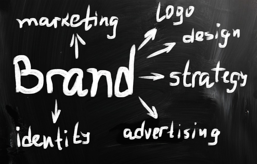
When it comes to effective branding, many of the world’s largest companies have honed their strategies to perfect. They understand exactly where to include their logos, which language to use and what color scheme is perfect for their offer.
Small businesses, on the other hand, often don’t have an established strategy when branding is concerned. Their brochures, signs and other print items are designed a step at a time, often without a guiding strategy or list of tactics.
If you run a small business but would like to develop it into a well-known brand, one of the best methods of achieving this is by learning from the big brands. Read on and we’ll share six color, layout and branding tactics the big brands use frequently.
Never miss an opportunity to include your logo
Have you ever looked through a brochure for an established brand? Have you seen a print advertisement for Nike, McDonald’s or Toyota? All of the world’s largest brands understand the importance of showing off their logo whenever possible.
There’s a reason you remember the Mercedes Benz or Apple logos instantly – they’ve been shown to you so many times that they’re imprinted into your memory. Use the same strategy to develop the strength of your logo and increase brand recognition.
Use your company’s color scheme for all brochures
What’s your company’s color scheme? Every company has its distinct colors – from the colors used in its business cards and branding to favorite colors that stand out from the crowd and look great.
Just like it’s a good tactic to show off your logo whenever possible, it’s important to always use your company color scheme in brochures and other print items. This is an excellent way to increase brand recognition and help people remember you.
Stick with simple concepts that reflect your values
Have you ever noticed how simple Apple, Nike, Coca-Cola and other leading brands make their advertisements? The best brands don’t need complex ads to stand out – they understand that it’s often better to be simple and easily understandable.
Instead of trying to cram information into your next brochure, stick with the most simple concepts and design elements you can think of. Simple is memorable, and it helps brand recognition to have a simple brochure that any reader can understand.
Understand the importance of engaging copy
Great brands understand the importance of engaging copy. Many small businesses, unfortunately, don’t. Copy is what helps people connect with your brand and form their own relationship with it, making it the most important aspect of any brochure.
Instead of focusing solely on design, split your focus between design and copy. An incredibly simple design with highly engaging, effective copy will often beat a slick, stylish design with copy that fails to connect with and engage your audience.
Use contrast to make your key points stand out
Every brand has unique selling points – things like low prices, outstanding features or amazing benefits that separate it from the competition. Visual contrast, such as a light typeface on a dark background, can help make these key points stand out.
From bullet points to subheadings, use visual contrast in your brochure’s design to help the most important points of your brochure stand out. A slight change in your background color can make text more readable and increase reader engagement.
Remember that your offer reflects your brand
Your brochure’s offer – often a free sample, consulting information or anything else – has a major impact on how people perceive your brand. The wrong offer can have just as profound effect on your brand as ineffective design or badly written copy.
Think about the image that you’re trying to portray – whether it’s exclusivity, value or something else – and make sure your offer matches the copy used in your sign or brochure and its visual identity.
FAQs
- Why is consistent logo placement important in branding?
Consistent logo placement across all marketing materials reinforces brand identity, making it easier for customers to recognize and remember your brand. This repetition enhances brand recall and trust. - How does using a company's color scheme in materials benefit branding?
Utilizing your company's color scheme consistently across brochures, signage, and other materials strengthens brand recognition. It creates a cohesive visual identity that customers can easily associate with your business. - What are the advantages of simplicity in design for advertisements?
Simplicity in design ensures that your core message is clear and memorable. By avoiding clutter, you allow the essential information to stand out, making it easier for customers to understand and recall your brand's values. - How does engaging copy influence customer connection?
Engaging and relatable copy in your marketing materials fosters a deeper connection with your audience. Well-crafted text can resonate with readers, enhancing the overall effectiveness of your design and message. - Why is visual contrast important in highlighting key information?
Using visual contrast, such as light text on a dark background, effectively draws attention to crucial information. This technique ensures that your main messages are easily noticeable, enhancing their impact on the audience.


