


Key Takeaways
- Use Sans-Serif Fonts for Clarity
Sans-serif fonts like Futura and Montserrat are clean and modern. They are highly legible from a distance and ideal for signage. Their simplicity improves readability and customer engagement. - Choose Classic Serif Fonts for Elegance
Serif fonts like Garamond add sophistication to menus and brochures. They work well for printed materials with large bodies of text. Their timeless style enhances professionalism and credibility. - Opt for High-Contrast Fonts
Fonts with bold strokes and clear letterforms improve visibility. Neutraface and FF DIN stand out against various backgrounds. High contrast ensures easy reading in different lighting conditions. - Ensure Proper Spacing and Alignment
Good letter spacing prevents text from looking cramped. Wider apertures in fonts like Montserrat enhance clarity. Proper alignment creates a polished and professional appearance. - Match Fonts with Your Brand Identity
Consistency in font usage strengthens branding. Use fonts that reflect your business's personality and style. A well-chosen font helps reinforce brand recognition and customer trust.
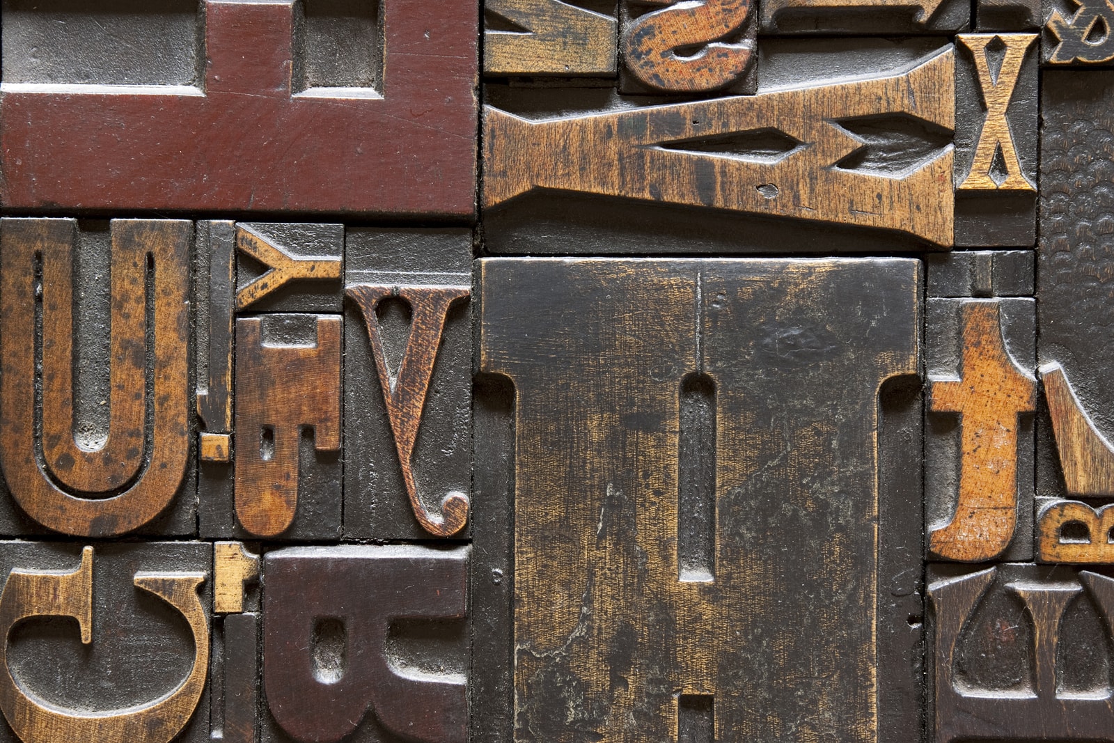
One of the most important aspects of graphic design for marketers is legibility. Fonts that are clear, simple and easy to read make communicating your message far easier and more effective.
Many marketers make the mistake of choosing fonts that are stylish, eccentric and – in far too many cases – difficult to read. The more complex your choice of fonts are, the less likely it is that everyone will understand your marketing message.
Instead of expanding your reach or investing in more signage, one of the best ways to get more bang for your buck from your retail signage is to make it easier for the people that already see it to read.
Choose the right font and your message will go from taking five seconds to read and understand to being instantly understandable to anyone that sees it. Read on to find out which five easy-to-read fonts are perfect for effective retail signage and more.
Garamond
Garamond is a traditional serif typeface that’s one of the most popular in the world of print marketing. It’s widely available on PCs and Mac, built for optimal legibility and perfect for use in advertisements and brochures with lots of text. As an additional tip: place these promotional materials on acrylic brochure holders where people can easily find.
If your marketing materials use long, dense copy, readability is extremely important for making sure people understand your message. In legibility tests, Garamond often ranks among the most readable fonts, especially for large passages of text.
When legibility is important and ensuring your target audience takes in your whole marketing message is essential, a traditional serif font like Garamond is one of your best choices.
Futura
Unlike Garamond, which is a traditional serif typeface, Futura has no serifs and uses a geometric design. Each letter is designed to use straight lines and shapes to make it easy to view and understand.
Futura is an excellent font to use in modern advertisements, especially in headlines and other pieces of text that need to be clear and easy to understand. Its geometric design makes it useful in a variety of modern settings.
With a simple, easy-to-read look and style that looks equally appropriate advertising a revolutionary new product as it does outside a traditional retail business, Futura is one of the most versatile sans-serif fonts for marketers.
Franchise
Franchise is a free font that resembles the powerful display fonts of the 20th century marketing style. It’s simple, easy-to-read and extremely powerful, using all caps as a way to stand out from the crowd and get your message across.
Since Franchise is a caps-only font, it’s best used lightly in headlines, subheadings or important pieces of copy. All-caps fonts generally don’t work as well in large bodies of text, since the uniform height makes them hard to read quickly.
As a break between sections in your brochure or an eye-catching headline font that stands out from the crowd, Franchise is an excellent choice that’s suitable for a huge range of different businesses.

Nevis
Nevis is another free font – a stylish, angular headline font that looks just as good on a billboard for an adventurous outdoor brand as it does inside the office of a modern technology company.
With angular letters and beautiful spacing, Nevis is clean and incredibly easy to read in large blocks of text. It’s also powerful enough to be used in headlines, especially in all caps, which immediate stands out from its background.
As a sans-serif font, Nevis is best suited for headlines and subheadings and isn’t such a good choice for paragraph copy. Despite this, its spacing and clear letter design are perfect for small snippets of text in retail signs and brochures.
Miller
Miller is a stylish and impressive “Scotch Roman” typeface, according to its creator Matthew Carter. With a powerful look that’s still easy to read, Miller is a good option for use in newspapers, magazine advertisements and long brochures.
As a serif typeface, Miller is easy to read and perfect for long blocks of text, making it a good choice for sales letters and long brochures that will be placed in literature holders. The longer your copy is, the more important it becomes to choose a font that’s easy for readers to understand.
Although it’s not powerful enough for headlines outside of a print setting, Miller is a good choice for subheadings and text snippets. This stylish font is a great alternative to classics like Garamond.
FAQs
- Why are sans-serif fonts best for signage?
Sans-serif fonts are clean, modern, and easy to read from a distance. Their simplicity ensures clear communication in high-traffic areas. Bold sans-serif fonts improve visibility. - When should I use serif fonts like Garamond?
Serif fonts work well for brochures and menus that require an elegant touch. They enhance readability in long-form printed text. Their classic appeal makes them ideal for luxury branding. - What makes a font high contrast?
High-contrast fonts have strong, bold strokes that stand out clearly. They ensure readability in different lighting conditions. Contrast between the font and background improves text visibility. - How does spacing affect readability?
Proper letter and line spacing prevent overcrowding. Fonts with generous spacing, like Montserrat, are easier to read. Well-spaced text enhances clarity and visual appeal. - Why is font consistency important for branding?
Using the same fonts across all materials strengthens brand identity. A consistent look improves customer recognition and trust. Matching fonts with your brand message ensures professionalism.


