


A promotional brochure is absolutely vital when you want to promote your business or bring to the fore new products or services that your customers may not know about. But too often, we overdo simple things and ruin the whole purpose of a promotional brochure.
Providing product-specific information is the most important goal of a brochure and all design and illustration should point towards that direction. When designing your next promotional brochure, you should avoid these three horrible mistakes that make you look like a rookie.
1. Including too many details and write-ups
Too much information is counterproductive to your goal and honestly, most people are not interested in the what-not details about your product or service. The most important details about your product or service include the price and benefits. In most cases, shoppers already know the features they are looking for in a certain product but may not know the benefits they will get by purchasing your product or service. Unique benefits are the actual selling points and you should focus on highlighting them in your promotional brochure. Benefits always go with an emotional tilt to it which means it is most likely to inspire action. About 62% of shopper will decide to buy a product based on impulse. When you keep the copy brief and simple, while tapping on the emotional benefit that your product offers, you will be amazed at how positively the customers will respond.
2. Lack of or using poor quality graphics and images
The quality of prints, graphics and images should be excellent for your promotional brochure. Using pixelated images and poor graphics will make your brand seem cheap. If you are going to have a promotional brochure that will elicit a positive reaction, you need to pay keen attention to the quality of the printing material, images, and graphics. Customers are easily drawn to impressive graphics and visuals and will create a lasting impression.
Also, the colors that you choose can have a significant impact on the effectiveness of your promotional brochure. Do not exaggerate the use of colors. Little use of color is always the best way to go about it to help your brochure standout. Vibrant and bold colors have the best overall effect on customers. More importantly, the color theme that you choose should rhyme with your brand colors. This will emphasize your brand identity and make it more memorable even after your customers leave the store.
3. Lacking a personal connection in your copy and presentation method
Understanding your target market will save you costs in the long run. The quality of copy that you use in your promotional brochure determines the actions that your customers will take. This is only possible if you understand the needs of your customers and attend to them in a personalized manner. The copy should hit the right notes and use plenty of action words.
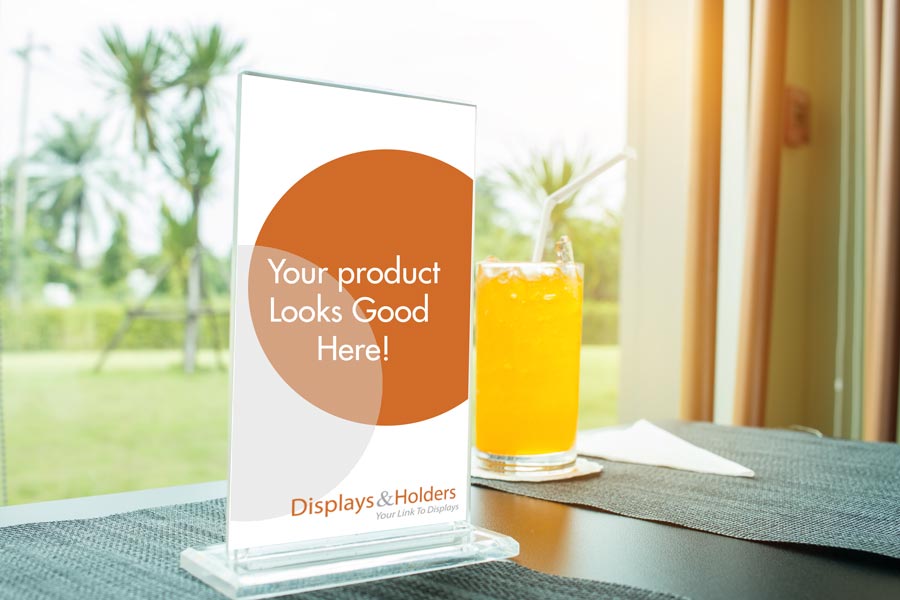
Finally, as a way of enhancing the personal touch, the level of presentation and placement of your brochure matters a lot. By using well-designed acrylic brochure holders, you could tap into the personalized presentation method. The type of brochure holder that you choose is dependent on the type of retail business that you operate. In general, the type of brochure holders can be customized to include your brand logo. This enhances your brand identity and consistency.
Our experts are ready to help you with the right kind of acrylic brochure holders that will suit your business needs for the highest return in sales revenue.


