


You only have a few seconds to make an impression with your retail signage. This makes readability one of the most important aspects of effective design – one that any designer should prioritize.
If people can’t read the content of your signage, it’s unlikely to have any positive effect on your sales and revenue. Choosing the right combination of typeface and color can increase your sign’s readability and make it far more effective.
From the right font to the right combination of text color and background color, a wide range of factors go into making text easy to read. Read on to learn four simple tips for more effective, more readable text in your retail signage.
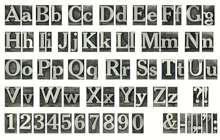
Choose simple, sans-serif fonts
The key to readable text is a simple font. Complicated fonts, such as script fonts or stylized fonts, can look great when used for short headlines, but they’re often too challenging to read to be any good on a sign that’s designed for action.
The longer it takes people to understand the text on your sign, the lower the chance of them completing your desired action. For effective signage, stick with a font that’s easy to read and free of complications.
A simple, sans-serif font is almost always the best choice for headlines, subheadings and other quick and simple content. Likewise, sans-serif fonts can work well for sign copy, provided the copy isn’t overly dense or lengthy.
Avoid overly bright colors
Brightly colored text can occasionally look good, but it more often than not is hard to read and out of place. Avoid using overly bright text unless you’re placing text on a dark background that doesn’t clash with the text color.
Color combinations like yellow text on a white background are difficult to read and far more likely to annoy passersby than attract their attention. Stick with colors that can easily be read without people having to focus in order to understand them.
Black-on-white, blue-on-white and other simple color combinations are usually the most effective. A good litmus test for whether or not a color is suitable is how well it fits into its setting – if it looks natural, it’s probably a good choice.
Use a light stroke on large text
A stroke – a light outline around text – can make large text easier to read, especially if the background color of your sign is similar to the color of your text. Adding stroke to your text is a good idea, albeit only in certain circumstances.
Try to avoid adding a stroke to small text, as it rarely increases readability and often makes it difficult to work out the shape of characters. This is particularly difficult if a stroke is placed on the inside of the text, rather than on the outside of characters.
Use a light stroke – no more than two to three points on large text – to outline each character’s shape and make it more visible without affecting the shape of the letter and its readability.
Make sure your text is a good fit
The key to readability is both the text and the space around it. When text ‘fits’ into a space, it naturally becomes more readable. Think about the difference between one line of text, which is easy to read quickly, and a long and dense paragraph of text.
One of the easiest ways to improve your sign’s readability is to break up sections of text into individual lines. Instead of using a paragraph of copy, break your copy into a series of bullet points or short, quick and simple sentences.
Text that ‘fits’ into its space will almost always be easier to read than text that’s part of a long paragraph. Make your text more readable by using white space and spacing to isolate it from other passages of text and helping it stand out for passersby.


